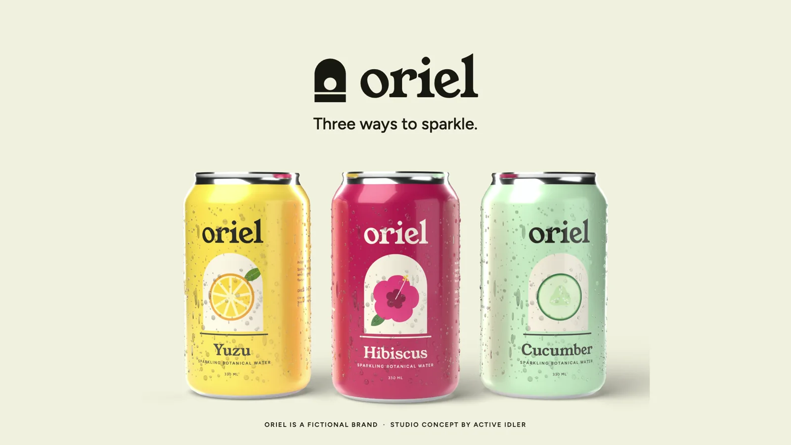
Studio concept. Oriel is a fictional drinks brand we created, and its cans are 3D renders we designed and modelled.
Oriel: three ways to sparkle
A drinks identity and its first ad: three cans built in 3D, each flavour arriving on its own colour.
- Identity and can labels
- 15 second ad
- 9:16 cut
- 6 second bumper
Techniques
- Identity and packaging design
- 3D can modelling and label mapping
- Condensation and studio light
- Label wipes locked to colour bands
- Kinetic type
- Cut-downs: 9:16 and 6 s
- Original score
The brief (fictional)
Oriel makes sparkling water with real botanicals, in three flavours. It needed a can, and a first ad that shows all three without turning into three ads.
The idea
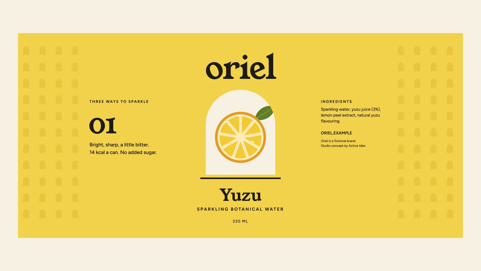
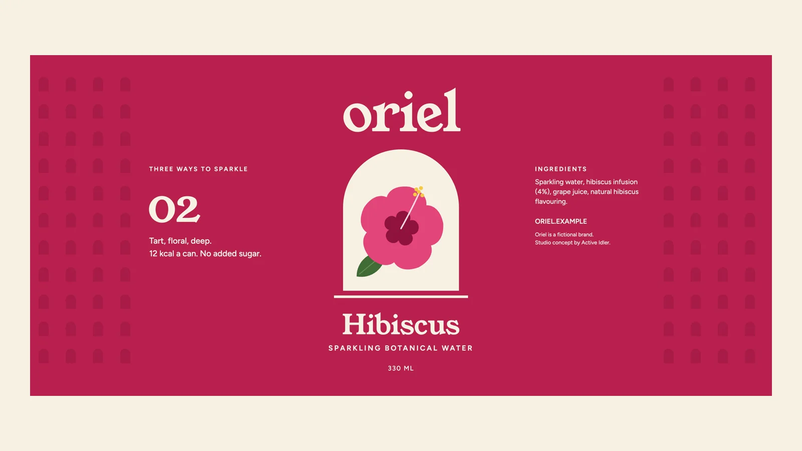
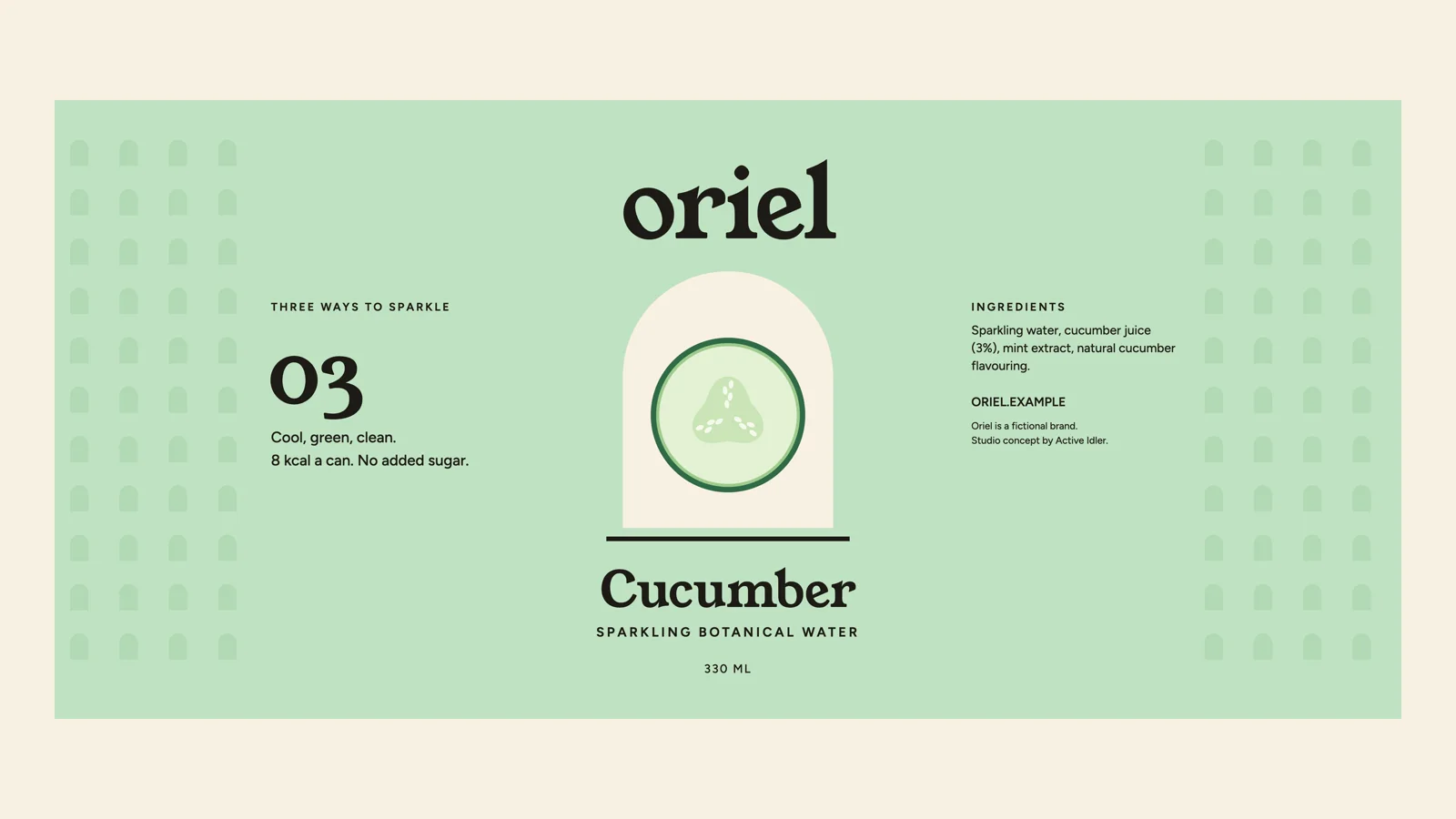
An oriel is a window that catches the light. The mark is an arch with a low sun in it, and on each can the arch is a window onto the flavour: a slice of yuzu, a hibiscus flower, a slice of cucumber, drawn flat so every colour can change.
In the ad each flavour owns the whole frame in its colour. The next one arrives as a band of colour, and as the band crosses the can, the label changes along the same line.
The ad, moving
The identity
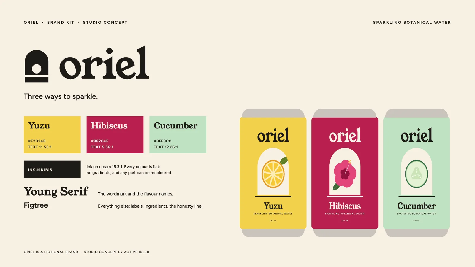
What a client team would receive
Identity, packaging, 3D, animation and sound: Active Idler.
- Wordmark, mark and colours as files
- Can label artwork for each flavour
- The 3D can, its materials and the render scene
- The ad in 16:9 and 9:16, and the 6 second bumper
- ProRes masters
Want this for your brand?
Tell us what you are launching and when. We will tell you what we would make first.