Rewarded video ads and app promos: what the format asks of a small crew
What a rewarded video ad asks of a small crew: plan the deal before the shots, win the first frame, and budget for the close button.

What a rewarded video ad asks of a small crew: plan the deal before the shots, win the first frame, and budget for the close button.
Rewarded video ads are a deal, not a film
A rewarded video ad is not a short film. It is a contract. Viewers are being paid to watch, in coins, lives, hints or extra spins, and everything the format asks of a small crew follows from that one fact. Before you plan a single shot, you plan the deal.
That changes the work. A brand film asks for patience first and offers meaning later. A rewarded ad has already promised the payment before the first frame exists. Your job is to make the payment feel earned, and to do it inside a window the viewer can slam shut with a thumb.
Three formats get confused in a single brief, and they are not the same job. The rewarded video ad is watched by someone already inside the app, who chose the ad to get something. An app store promo is watched by someone deciding whether to install at all. An in-app explainer is watched by someone who installed and needs to understand a feature. Same product, three different questions, three different edits.
Most briefs arrive without that distinction. A team knows it wants a video and hands over a competitor's ad and a target number, and the format is left to sort itself out.
It will not. This format is unforgiving, and it is honest about being unforgiving. That is the good news.
What the player sees before your ad plays
Your ad lives inside somebody else's economy, and you are borrowing the player's patience. Before your first frame there is a button, and the button is the whole brief. It says something like "Watch to earn 50 coins", or it offers a hint, a life, a spin. The number is set by the product team, not by you.
Then there is a countdown, or the ad simply starts. After a few seconds a close X appears in a corner. A viewer's thumb hovers over it from the moment it appears. Every second after that X shows up is a second you have to justify.
Look at the screen around your ad. There is a game or a tool underneath it, in its own visual language, with its own colour and type. Your ad appears on top of that. If it looks like it belongs to a different product entirely, the viewer reads it as an interruption rather than a transaction, and the X gets tapped.
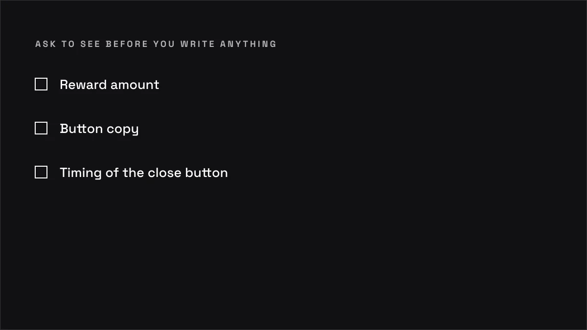
The step people get wrong here is treating the surrounding UI as somebody else's problem. It is not. Reward amount, button copy and the timing of the close button all set the terms you are filming against. Ask to see them before you write anything.
The first frame has to be the offer
The first half-second is a promise, not a mood. In a rewarded ad the viewer has already agreed to a trade, and the first frame is where you confirm that the trade was a good one. A slow logo reveal confirms the opposite. It says: this is a film about us, and you are not in it.
Compare two openings for a puzzle game that pays in hints. Opening A: black frame, logo animates in over two seconds, soft music swells, then a montage. Opening B: a hard cut to a puzzle mid-solve, one move from failure, and a single line of text naming the reward. Opening B has told the viewer why they were paid. Opening A has told them about a brand.
Cinema trains the opposite instinct. In the festival work I watch on MUBI, and in the Cannes, Sundance and TIFF selections I keep up with, the best opening frames are usually withholding something. That instinct is wrong here. A rewarded ad should withhold nothing at the top. The reward is the hook, and the craft goes into making the hook feel like a story rather than a coupon.
The step people get wrong is treating the first frame as a title card. There is no title card. There is no room for one. The first frame is a line of the offer, and the logo can arrive at the end, when you have something to sign.
Six seconds is a budget you plan for
Fifteen seconds sounds generous until you remember that the viewer can leave after a few of them. Plan the arithmetic before you plan the shots. On a 15-second rewarded ad, assume you have the first few seconds before the X appears, and treat everything after that as a bonus you have to keep earning. On a 30-second ad the same logic applies, stretched, and the middle is where attention leaks.
Work it through with a puzzle game. A hint is the reward. The ad has to make the hint feel earned, which means the viewer has to see a problem they recognise and a solution that arrives because of the reward. That is three beats: the stuck moment, the hint arriving, the solve. On a 15-second cut, the stuck moment has to land in the first couple of seconds, the hint by the middle, and the solve before the close button gets tapped.
If the solve lands at second twelve, you have spent the reward before the viewer has decided to stay. If the stuck moment lands at second four, you have already lost. Beats do not move. You move the cutting around them.
The step people get wrong is storyboarding for the ideal viewer who watches all fifteen seconds. There is no ideal viewer. There is a person who was paid a hint and is checking whether the ad is worth the hint. Storyboard for the person who leaves at second five, and make sure they got the offer.
App promos answer a different question
An app store promo sells the app to somebody who has not installed it. What is in their head is not "is this worth my reward" but "what is this, and why would I keep it". That is a colder, more sceptical viewer, and they are looking at a page full of other apps while they decide.
The work starts before the preview plays. Icon, first two screenshots and title do most of the selling. The preview is the proof. If the screenshots are messy, the preview is arguing against the page, and the page usually wins because it is what the thumb is closest to.
First three seconds of the preview are the whole audition. Show the app doing the thing it is best at, on a real screen, at a size a phone can read. Do not open on a logo. Do not open on a smiling person holding a phone. Open on the product working.
Founders often want the app explained, and the honest answer is that an app store promo is not an explanation. It is a demonstration. The explanation belongs in the in-app explainer, which is a different deliverable with a different viewer.
The same product shot two ways
Take one feature and cut it twice. That is the fastest way to understand the difference. Say the feature is a dashboard that flags overspending. For the rewarded ad, you shoot a promise: a number flashing red, a single line of text, a fix arriving in one tap, the reward tied to the relief. For the app store promo, you shoot a proof: the actual dashboard, the actual flag, the actual tap, filmed on a phone screen so the viewer believes it is real.
One is a promise. One is a proof. Neither is wrong.
Promise cut is allowed to be dramatic, because the viewer already trusts the app enough to be inside it. The proof cut has to be plain, because the viewer is deciding whether to trust it at all. Put the dramatic cut on the store page and it reads as advertising. Put the plain cut in the rewarded slot and the viewer feels cheated of the reward.
The step people get wrong is thinking one good cut can serve both. It cannot. The footage can be shared. An edit cannot.
Where each option wins
Each format wins on its own terms, and loses when it is asked to do another format's job. The table below is the comparison to settle before anyone agrees on a brief.
| Rewarded video ad | App store promo | In-app explainer | |
|---|---|---|---|
| Who chooses to watch | A player already inside the app, trading attention for a reward | Someone browsing the store, not yet installed | An existing user who needs to understand a feature |
| What they already know | They know the app, the reward and the economy | They know almost nothing, and they are comparing you to competitors | They know the app but not this part of it |
| Attention budget | Seconds, with an exit always available | The first three seconds of the preview, then the screenshots | Longer, because the user is already invested |
| Cost of a reshoot | High. The reward and the loop are baked into the cut | High. The store page is a live shopfront and review cycles are slow | Lower. It can be updated inside the app on your own schedule |
| Who really decides the brief | The growth team, with the product team owning the reward | The product and marketing teams, with the store metadata owner | The product team, usually with support and onboarding |
| Where it genuinely wins | Reaching existing users at a moment they have chosen, at a low cost per view | Converting a cold browser into an install | Reducing support load and drop-off after install |
Rewarded ads win on cost and consent. Viewers opted in, which is rarer than it sounds. App store promos win on reach, because they are the front door. In-app explainers win on depth, because the viewer is already there and willing to spend time.
What the table does not show is how often a client asks for one and needs another. A growth team asks for a rewarded ad when the real problem is store conversion. A product team asks for an explainer when the real problem is that the first screen is confusing. The format is a symptom. Diagnosis is somebody else's job, and you should say so.
The edit is where the format is won
You can shoot a perfect rewarded ad and lose it in the edit. The format lives in the cutting, because the cutting is where the reward economy either holds or collapses. Front-load the payoff. If the hint arrives at second nine, the viewer who leaves at second six never saw it, and you paid for a view that did nothing.
Then cut the loop. The last frame should send the viewer back into the app, not out of it. That means the final beat is the reward landing in the app, not a logo on a black card. A logo can be there, small, over the app. It should not be the last thing they see.
The step people get wrong is editing for the client review. Reviewers watch the whole cut, twice, with sound, on a laptop. Players watch a few seconds, muted, on a phone, with a thumb ready. If you cut for the room, the room will love it and the player will leave.
I cut and grade on DaVinci Resolve Studio, and the discipline is the same as any other edit: watch it on a phone, at arm's length, with the sound off, before you send it. If the offer does not survive that, it does not survive.
What a small crew actually needs on the day
This format does not need a large crew. It needs a shot list that respects the first frame and the last. A middle can be built. The two ends cannot be faked in the edit.
Plan the shots around the six-second window. That means the stuck moment and the reward landing are both shot as clean, readable frames, not as coverage you will find later. Shoot the loop separately, as its own setup, with the app screen in the state the viewer will return to. Shoot the end card separately, so it can be versioned for different rewards without a reshoot of the whole ad.
On the day, the practical checklist is short. Get the app screen recording at the right resolution and frame rate. Get the real device in hand, not a mockup, unless the product team insists on a mockup and understands the risk. Get a clean pass of the first frame and a clean pass of the last frame, both usable without effects. Everything else is the middle, and the middle is where you have room.
The step people get wrong is shooting the ad as a single continuous piece. It is not. It is a first frame, a loop and an end card, with a middle that serves them.
When you should not shoot at all
If the app is not built, or the reward economy is not defined, the ad cannot be made well. Shooting around an undefined reward produces a beautiful film that pays the viewer in nothing.
The client's product team is the authority on the loop. They know what the reward is worth, how often it can be granted and what the player does with it. Your job is to film the trade, not to invent it. If the product team cannot tell you the reward amount and the moment it lands, wait.
Same applies to the app store page. If the screenshots and the icon are not settled, the preview is being built on sand. The store metadata owner decides that, not you, and not the growth team alone.
Waiting is a real option, and it is usually cheaper than the reshoot. A few weeks of delay before the shoot is nothing next to a cut that has to be rebuilt because the reward changed.
The brief that comes from the growth team
The brief usually arrives as three numbers and a competitor's ad. A target cost per install, a reward amount, and a link to something a rival shipped last quarter. That is not a brief. It is a wish with evidence attached.
Ask for what is missing. Average session length, so you know how much attention the player actually has. The drop-off point in the funnel, so you know whether the ad is meant to bring people in or keep them. One metric the ad is supposed to move, named plainly, because a rewarded ad that is meant to lift retention is cut differently from one meant to lift installs.
The client's finance and growth teams own those numbers. I do not set them, and I should not pretend to. What I can do is ask the right questions, and refuse to start until somebody answers them.
The step people get wrong is accepting the competitor's ad as a creative reference. It is a market signal, not a template. Copy it and you have copied a decision that was made for a different product, a different economy and a different audience.
The app store promo is a different edit
The store preview and the rewarded ad are cut from the same footage and should not share a timeline. The store preview opens on the product working, in the first three seconds, because the viewer is deciding whether to install. A rewarded ad opens on the offer, because the viewer has already installed and is deciding whether to stay.
Captions matter more on the store page, because the preview autoplays muted in a list of competitors. Aspect ratio matters too: the store has its own rules, and a cut that ignores them gets cropped or letterboxed in ways nobody planned for. Check the spec before the shoot, not after.
The step people get wrong is using the same cut for both and wondering why one underperforms. Footage is shared. The edit is not. A store preview that opens on a logo is a store preview that gets skipped. A rewarded ad that opens on a product demo is a rewarded ad that gets closed.
If you are cutting both, cut the store version first. It is the colder, harder version, and it forces you to be honest about what the product actually does. A rewarded cut is easier once the proof exists.
Sound, text and the thumb
Most rewarded ads play muted, or with sound off by default. Text carries the offer. If the ad only works with the music, it does not work.
Compare two cuts. Cut A relies on a music swell to land the reward: the track builds, the hint appears, the viewer feels it. Cut B relies on a single line of text: "Hint unlocked", on screen for long enough to read, timed to the moment the reward lands. Put both in front of a muted phone and Cut A is a sequence of images with no meaning. Cut B still communicates the trade.
The difference is not taste. It is where the viewer's eyes are. On a phone, muted, in a game, the eyes are on the reward. Text has to be where the eyes already are.
The step people get wrong is treating captions as an accessibility afterthought. In this format they are the primary channel. Design them at the same time as the shots, not in the edit.
How long the whole thing takes
A rewarded ad or app promo takes a few weeks, and the weeks get eaten by the same things every time. Research and brief, pre-production, shoot, edit, review, delivery. The shoot is rarely the long part. A review is.
Stakeholder rounds stretch it. A growth team, a product team and a brand team all have notes, and the notes arrive in sequence rather than together. App store review adds time you cannot compress, because it is somebody else's queue. Localisation adds time, because every language version is a new cut with new text timing.
Plan for the review to take as long as the edit. If that sounds pessimistic, it is not. It is the arithmetic of a room with three teams in it. The step people get wrong is promising a delivery date based on the shoot, when the date is really set by the last stakeholder note and the store queue.
If you are an enterprise, you have a different problem
You have a brand team, a legal team and an app team, and the ad is one deliverable among many. That is a different problem from a startup's, and it needs a different conversation.
What I do: I film the product, the people and the moment, and I cut it for the format. I can hold the first frame and the loop to a standard, and I can flag when a brief is asking one format to do another's job.
What I do not do: I am not the authority on your app store metadata, your media buy or your legal review. Your store metadata owner decides the icon and the screenshots. Your media buyer decides where the ad runs and at what cost. Your legal team decides what claims can be made. Those questions go to them, and the shoot waits for their answers.
Naming that boundary early saves everyone time. An enterprise brief that treats the filmmaker as the authority on all of it will stall, because the filmmaker is not.
The ask is the film
Return to the button. A viewer is choosing to watch, and the reward is the reason. A deal is what the format asks for, and the film is the terms. Everything else, the first frame, the six-second window, the loop, the text, the edit, is the drafting of those terms.
The work is to make the terms honest. A rewarded ad that promises a hint and delivers a logo has broken the deal. An app promo that promises a product and delivers a mood has done the same. The small crew that wins is the one that plans the deal before a camera moves, and holds the cut to it.
Whether the format is getting more honest or just more transactional, I am not sure. The viewer is being paid, and they know it. The ad is being watched, and it knows it. That is a clearer relationship than most advertising manages, and a colder one. I keep coming back to the button, and to the thumb hovering over it, and to the question of whether a fair trade is the same thing as a good film.